
Color Trend & Inspiration
By Bryan Mann-Entzel, Managing Partner, Creative Lead
For folks like myself who work in the creative industry, PANTONE® is the go-to expert when it comes to forecasting color trends. But for the average person, your color trends appear in the marketplace. They show up in advertising, apparel, and all of the various things we buy. Trends in color also do not fade out as quickly as they use to–tending to layer year after year until they just don’t appeal to folks anymore.
One example I can think of was from about 10 years ago. I was researching color trends for spring and came across the teal/aqua color trend. It was still super early in that trend but before long, it was showing up in ads for paint, in bathroom accessories at Target, and in clothing. That particular trend stuck around for several years, which made me happy after caving to the call of the teal chinos I spotted at Banana Republic.
When I think about where I draw my own color inspiration from, it isn’t necessarily from the “Oracle of Color” or some high-fashion designer. Inspiration can come from almost any place. We simply have to understand how to spot something we like and take apart what we like about it. One of my personal favorites is Pinterest. Yes, the same one that crafters and foodies live by. Pinterest has an endless trove of great ideas regardless of what you are looking for, and the more you pin, the more it tunes to your interests. But getting back to the notion of COLOR, let’s look at how Pinterest might help inspire a color palette for a project. A quick search of “Teal Color Palette” and you get a collection of images, where someone has taken the time to extract the 5-7 key colors in that image.
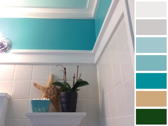
This is to me, one of the most inventive ways of exploring different color combinations—through mood boards of color. Let’s try a few other search combinations:
1. Antique color palette
2. Italian color palette
3. Masculine color palette
4. Craftsman color palette
5. Barbie color palette
6. Greige color palette
7. Yellow color palette
8. Sunny color palette
9. Cotton candy color palette
10. Dirt color palette
You are probably laughing at the last one, dirt color palette; but it yielded some really great visuals that were earthy and high contrast. There really are no limits to where this method of searching can take you on Pinterest. But now, pause for a moment, and let’s look at what these designers are doing. They are taking an everyday image. Maybe even something from a stock photo site, and extracting the key colors. That is honestly something that most of us can do. I liken it to building your whole living room around a piece of art, or a throw blanket that you love. You start with that one signature piece and build complimenting elements off of that, drawing out colors that tie to your original inspiration.
Color inspiration, like art, is in the eye of the beholder. Building your color inspiration should be fun. You are drawing on an emotional element. It can have cultural cues, historic relevance, or evoke appetite appeal. Regardless of what you are creating, take another look at how you approach your colors and don’t just settle for what you find in the default color palette of Illustrator or Indesign. Grab an image, and start sampling colors to build your own unique color story and give visual weight to them as you go… emphasizing some and reserving others for “just a touch”.